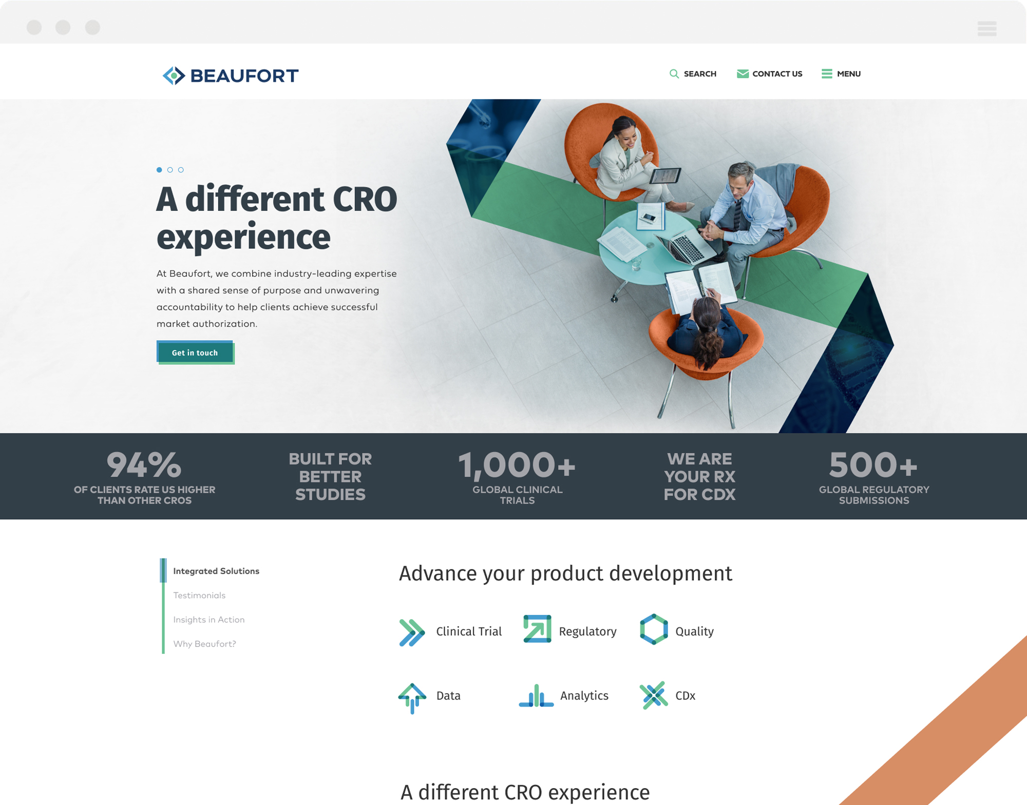
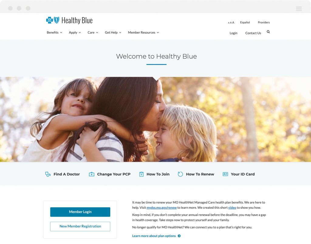
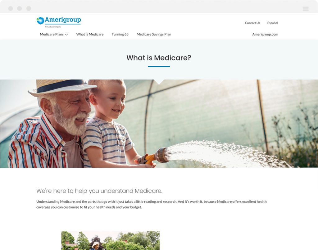
Beaufort was looking for a complete brand overhaul when they came to us, including a logo, fresh color palette, website, marketing materials, the works. Once the logo was approved I got to work with 3 different directions we could go for the website and additional marketing items. They were thrilled with the idea of a vibrant salmon in addition to a new saturated blue and green, representing a professional take on the intersection of science and technology. Rounding out the system I proposed pulling in transparent overlapping elements that would speak to the transparency you would get working with Beaufort.
TELLING THEIR STORY
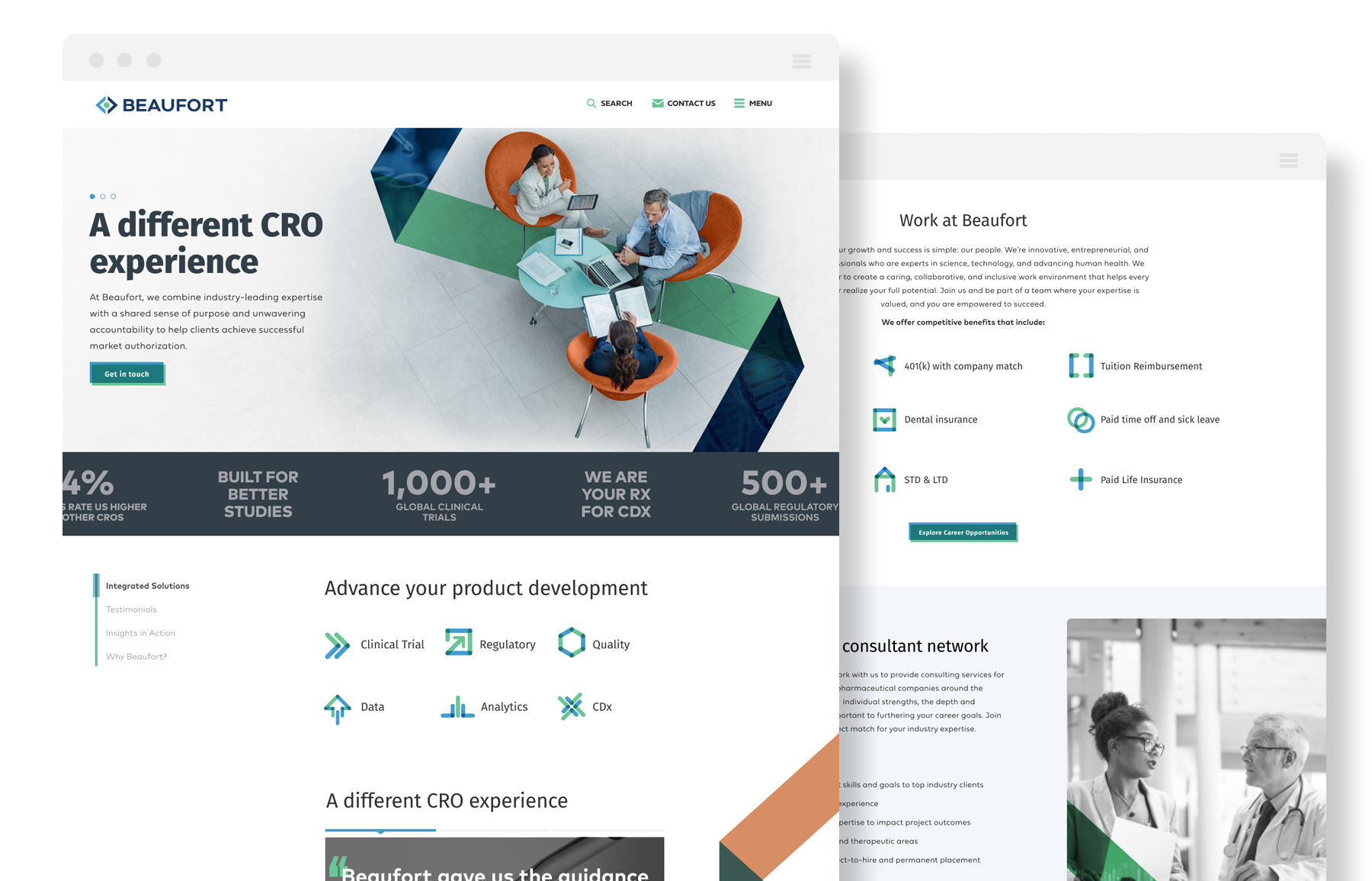
Beaufort offers a wealth of knowledge to their partners so we had a lot of information to sort through. I created a variety of components that could help separate sections in an easy to digest way, but made sure to ensure a solid user experience with bold contrast and custom created graphics to improve the page flow.
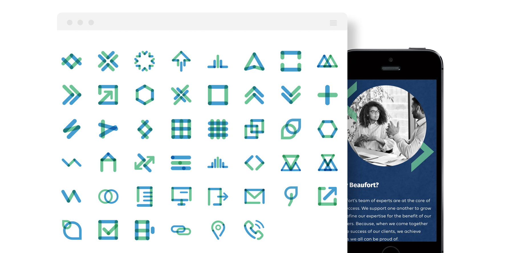
CUSTOM ICONOGRAPHY
In conjunction with the new branding I suggested taking the transparency concept one step further and overhauling their iconography. By building a completely custom system, we were able to connect all the common threads and help illustrate more abstract concepts like “regulatory affairs” and “therapeutic areas”. The client was thrilled with the new look and couldn’t wait to continue building it out in other formats.